Vectorbt Optimize Entry/Exit points with Python

What is VectorBt?
VectorBt is a python library designed to conduct lightening fast backtests. It does this by natively integrating Pandas and Numpy, and using Numba to speed up computations.
It also plugs straight into Plotly to produce some really neat visualizations with minimal fuss. You can be up and running testing a single indicator strategy in just a few lines of code.
Hyperparameter Optimization:
VectorBt lets us easily run through 1,000s of different combinations of parameters and compare metrics like total return, max drawdown, sharpe ratio, etc. If you give it a metric that you're aiming at, it can automatically find the optimum for you.
You can optimise as many parameters as you want, but if you want a nice visualisation, you'll have to choose 3 or less at the same time. In our case we'll just optimize our entry and exit points, giving us a nice 2d chart to draw. Also bear in mind that the more parameters you choose, the more resources required to compute the results.
A simple Strategy Simulation:
Let's kick off with a simple example which we'll expand on later. Make sure you've got some data handy, see our tutorial on scraping crypto price data from Bitstamp for instructions on that.
1import numpy as np
2import pandas as pd
3from datetime import datetime
4import vectorbt as vbt
5
6btc_price = pd.read_csv("btcusd.csv")[["timestamp","close"]]
7btc_price["date"] = pd.to_datetime( btc_price["timestamp"], unit = "s")
8
9btc_price = btc_price.set_index("date")["close"]
Basic stuff here, we load in the .csv from the same folder as the script, select the timestamp and close columns, convert the date column to Pandas datetime rather than Unix timestamp, and finally set the index to be the date.
Basically turning data that looks like this:
1high,timestamp,volume,low,close,open
229022.01,1609459200,0.86157958,28999.14,29006.31,28999.63
329086.90,1609459260,14.56195084,29007.31,29083.47,29007.31
429073.02,1609459320,3.03030144,29028.14,29035.89,29069.80
5                             ....
Into data that looks like this:
1date
22021-01-01 00:00:00    29006.31
32021-01-01 00:01:00    29083.47
42021-01-01 00:02:00    29035.89
52021-01-01 00:03:00    29048.13
62021-01-01 00:04:00    29045.19
7                         ...
We do this because as we mentioned before, VectorBt integrates great with Pandas and Numpy, so if we have our data here in a simple Pandas series, it makes our lives easier when doing the backtest.
Now we've got our data, we can go ahead and calculate our indicator. I'm going to use the RSI, but there are a variety of other common indicators you can choose from on the documentation. You can also make your own, but for now we'll stick with pre-defined functions.
1rsi = vbt.RSI.run(btc_price, window = 14, short_name="rsi")
With that we can calculate our entry and exit points:
1entries = rsi.rsi_crossed_below(30)
2exits = rsi.rsi_crossed_above(70)
For now I've arbitrarily decided that we're going to enter our trade when the RSI crosses below 30, and enter when it goes above. entries and exits are just regular Pandas series objects, with a label True or False for each closing value
1date
22021-01-01 00:00:00    False
32021-01-01 00:01:00    False
42021-01-01 00:02:00    False
52021-01-01 00:03:00    False
62021-01-01 00:04:00    False
7                       ...
Now we just feed in our entries and exits to simulate a portfolio, from where we can print out some stats.
1pf = vbt.Portfolio.from_signals(btc_price, entries, exits)
2print(pf.stats())
 1Start                               2021-01-01 00:00:00
 2End                                 2021-01-01 23:59:00
 3Period                                  1 days 00:00:00
 4Start Value                                       100.0
 5End Value                                     102.04406
 6Total Return [%]                                2.04406
 7Benchmark Return [%]                           1.366358
 8Max Gross Exposure [%]                            100.0
 9Total Fees Paid                                     0.0
10Max Drawdown [%]                               2.741746
11Max Drawdown Duration                   0 days 09:52:00
12Total Trades                                         17
13Total Closed Trades                                  17
14Total Open Trades                                     0
15Open Trade PnL                                      0.0
16Win Rate [%]                                  52.941176
17Best Trade [%]                                 0.983893
18Worst Trade [%]                               -0.531276
19Avg Winning Trade [%]                          0.440121
20Avg Losing Trade [%]                           -0.24039
21Avg Winning Trade Duration    0 days 00:33:06.666666666
22Avg Losing Trade Duration               0 days 00:46:00
23Profit Factor                                  2.053065
24Expectancy                                     0.120239
25Sharpe Ratio                                  16.379257
26Calmar Ratio                               58779.301424
27Omega Ratio                                    1.095292
28Sortino Ratio                                 22.434664
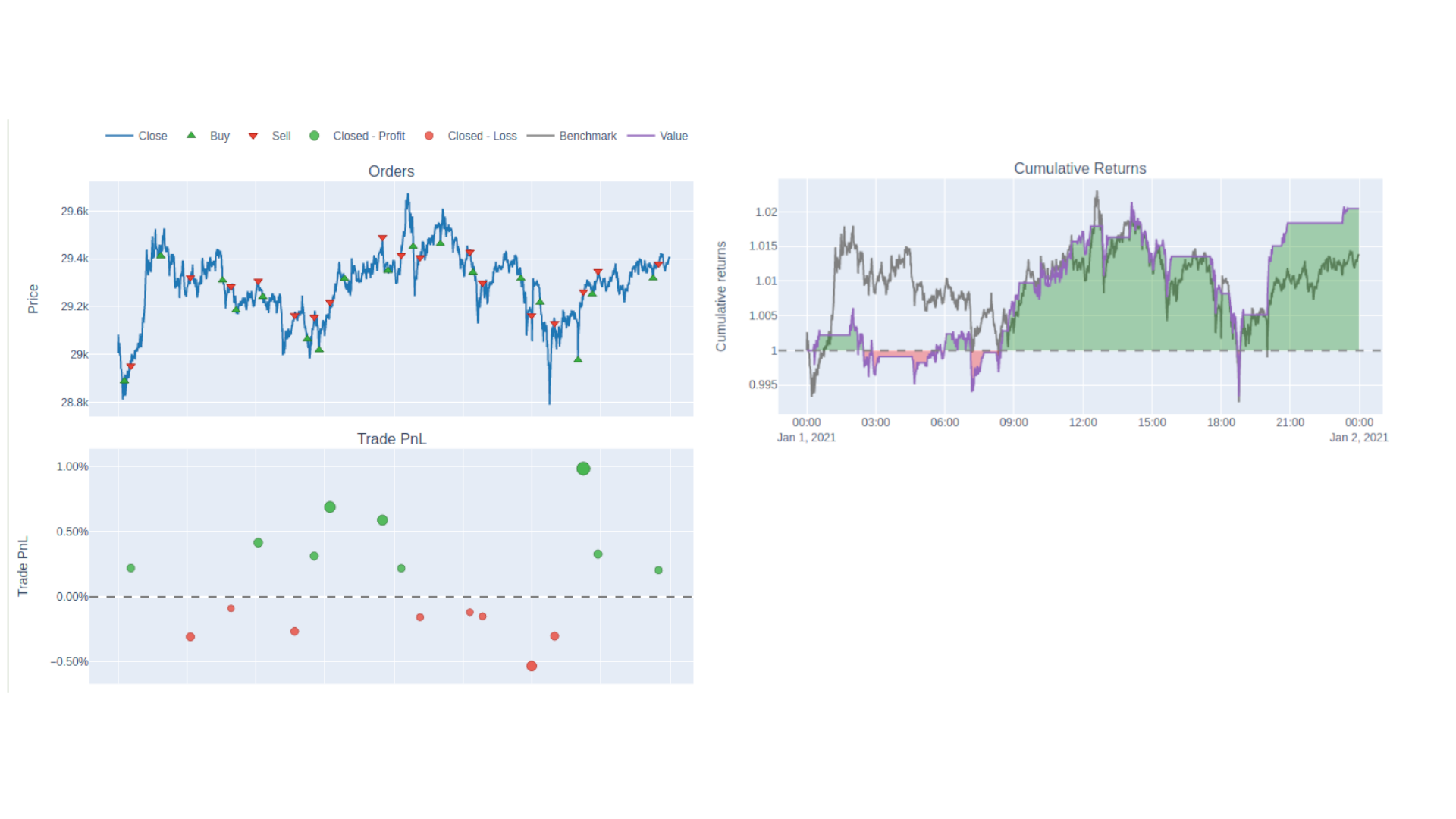
Instead of printing out the stats, you can take a visual view by instead calling pf.plot().show(), which will bring up a series of Plotly graphs showing when you placed your orders on a price graph, as well as your profit and loss on each trade and cumulative return so far.

If you're familiar with Plotly, you'll be able to tune this interface to show the metrics you're interested in and in the correct configuration.
Once you've got your backtesting template set up it's really easy to see how tweaking your parameters affects order placement and returns. In our case all we have to do is change our entries and exits. We can of course do this manually and have a poke around, but I'd rather have the computer do the work for me.
Grid Searching to find Optimum Parameters:
Grid searching refers to exhaustively testing every pair of possible parameters to see which ones perform best. VectorBt makes this really easy for us. First off we need to generate the pairs of variables. This handy little snippet will do just that for any two pairs of numerical values
1num = 10
2entry_points = np.linspace(1,45, num=num)
3exit_points = np.linspace(55,99, num=num)
4grid = np.array(np.meshgrid(entry_points, exit_points)).T.reshape(-1,2)
In short we generate num evenly spaced points between our limits, then take every possible pairing of the two.
 1[[ 1.         55.        ]
 2 [ 1.         59.88888889]
 3 [ 1.         64.77777778]
 4 [ 1.         69.66666667]
 5 [ 1.         74.55555556]
 6 [ 1.         79.44444444]
 7 [ 1.         84.33333333]
 8 [ 1.         89.22222222]
 9 [ 1.         94.11111111]
10 [ 1.         99.        ]
11          ...
Repeating for every other element in the first list. When we defined entries and exits earlier, we used single values, but they can take regular python lists as well. Using some fancy slice notation, list(grid[:, [0]]) lets us get just the left hand side of the pairs in grid and list(grid[:, [1]]) gives us the right hand side values.
We can then re-define our entries and exit series to use these new combinations
1entries = rsi.rsi_crossed_below(list(grid[:, [0]]))
2exits = rsi.rsi_crossed_above(list(grid[:, [1]]))
Printing those out gives us different columns for each value tested
1print(entries)
1rsi_crossed_below     1.0    1.0    1.0   ...   45.0   45.0   45.0
2date                                      ...
32021-01-01 00:00:00  False  False  False  ...  False  False  False
42021-01-01 00:01:00  False  False  False  ...  False  False  False
52021-01-01 00:02:00  False  False  False  ...  False  False  False
62021-01-01 00:03:00  False  False  False  ...  False  False  False
72021-01-01 00:04:00  False  False  False  ...  False  False  False
8                           ...
We can actually leave the definition of pf untouched, it's smart enough to figure out how to simulate all the different combinations.
The VectorBt section of our code looks like this now:
1num 10
2rsi = vbt.RSI.run(btc_price, window = 14, short_name="rsi")
3entry_points = np.linspace(1,45, num=num)
4exit_points = np.linspace(55,99, num=num)
5grid = np.array(np.meshgrid(entry_points, exit_points)).T.reshape(-1,2)
6entries = rsi.rsi_crossed_below(list(grid[:, [0]]))
7exits = rsi.rsi_crossed_above(list(grid[:, [1]]))
8pf = vbt.Portfolio.from_signals(btc_price, entries, exits)
Visualizing Parameter Combinations as a Heatmap:
Since we've got so many portfolios, we don't want to plot them all out in individual Plotly dashboards and inspect them manually, we want a nice visualization that shows everything clearly.
To do that, we start by extracting the metric that we want to plot from each of the portfolios.
1metric = "total_return"
2pf_perf = pf.deep_getattr(metric)
The documentation on how to use deep_getattr to get different metrics is a little nebulous, but here are a few other metric definitions I've found that work:
1metric = ("annualized_return",)
2metric = ("max_drawdown",)
3metric = "positions.win_rate"
4metric = "sharpe_ratio"
pf_perf here is yet another Pandas series with the variable combinations and then our metric on the right-hand column
1rsi_crossed_below  rsi_crossed_above
21.0                55.000000            0.000000
3                   59.888889            0.000000
4                   64.777778            0.000000
5                   69.666667            0.000000
6                   74.555556            0.000000
7                                          ...
Here we have a total return of 0, presumably because the lower RSI threshold is too low so it never triggered or made any trades.
In this case the higher threshold values are all bunched together. We can use vbt.unstack to expand this into a matrix with all possible combinations and the metric they produce
1pf_perf_matrix = pf_perf.vbt.unstack_to_df(
2        index_levels = "rsi_crossed_above",
3        column_levels = "rsi_crossed_below")
Note that you'll have the change the values of index_levels and column_levels here to reflect the headers in your pf_perf. Printing this out gives us a clear idea of what's happening.
1print(pf_perf_matrix)
 1rsi_crossed_below  1.000000   5.888889   10.777778  ...  35.222222  40.111111  45.000000
 2rsi_crossed_above                                   ...
 355.000000                0.0        0.0        0.0  ...   0.030806   0.031037   0.024906
 459.888889                0.0        0.0        0.0  ...   0.026122   0.027456   0.030758
 564.777778                0.0        0.0        0.0  ...   0.020581   0.029583   0.025761
 669.666667                0.0        0.0        0.0  ...   0.023866   0.022462   0.015333
 774.555556                0.0        0.0        0.0  ...   0.022975   0.009193   0.003373
 879.444444                0.0        0.0        0.0  ...   0.024750   0.004793  -0.000739
 984.333333                0.0        0.0        0.0  ...   0.025762   0.004958   0.004504
1089.222222                0.0        0.0        0.0  ...   0.019939  -0.000026  -0.000026
1194.111111                0.0        0.0        0.0  ...   0.019939  -0.000026  -0.000026
1299.000000                0.0        0.0        0.0  ...   0.019939  -0.000026  -0.000026
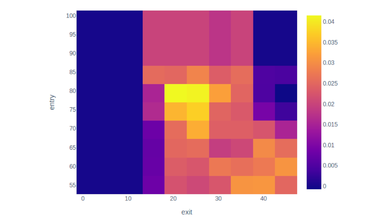
We now have our results in a grid with the column and row headers being different values of our parameters, and the row elements the metric value. So a higher threshold of 40.1 and a lower threshold of 55 produced a return of 3.1% in this case.
To draw the heatmap from here, it's just a matter of assigning each number a color and plotting. VectorBt does this with vbt.heatmap.
1pf_perf_matrix.vbt.heatmap(
2        xaxis_title = "entry",
3        yaxis_title="exit").show()

There you go! Have a play around with this and see if you can adapt it to fit your strategy, I'd love to know how you've used VectorBt in your backtesting pipeline.
If you enjoyed this tutorial I'd thoroughly recommend checking out the VectorBt notebooks written by the package author. They're a treasure trove of tactics for improving your strategies.
Video Tutorial
If you'd prefer a video tutorial, check out this free course from our youtube channel: