Plotting Custom Graphs in Vectorbt
VectorBt (Vbt) is great for doing speedy backtesting. But us mere mortals find it difficult to glean much from multi-dimensional arrays. So it might be worth throwing out a few graphs.
VectorBt uses Plotly as it's plotting framework. So if you've got experience with how Plotly figures work and how graphs are constructed, you'll have an easier time when it comes to plotting in Vbt.
If you're looking for hyper-parameter optimisation and 2d or 3d heatmaps, you'll want to try our other articles. In this article we're largely going to restrict ourselves to various bar charts, scatter charts, etc.
Defining our Strategy
I've drawn up a simple strategy here that we can draw data from in our plotting. It just takes the past three days of 1-minute candles, and tests a simple strategy where we enter on an rsi < 30 and exit on rsi > 60.
 1>>> import vectorbt as vbt
 2>>> import datetime
 3>>>
 4>>> now = datetime.datetime.now()
 5>>> before = now - datetime.timedelta(days=3)
 6>>> btc_price = vbt.YFData.download(
 7...     "BTC-USD",
 8...     missing_index='drop',
 9...     interval='1m',
10...     start=before.timestamp(),
11...     end=now.timestamp()
12...     ).get('Close')
13
14>>>
15>>> rsi = vbt.RSI.run(btc_price, window=21)
16>>>
17>>> entries = rsi.rsi_crossed_above(60)
18>>> exits = rsi.rsi_crossed_below(30)
19>>>
20>>> pf = vbt.Portfolio.from_signals(btc_price, entries, exits)
Built-in Portfolio Plots
There's quite the selection of built-in plots that we can use, the most basic being
1>>> pf.plot.show()
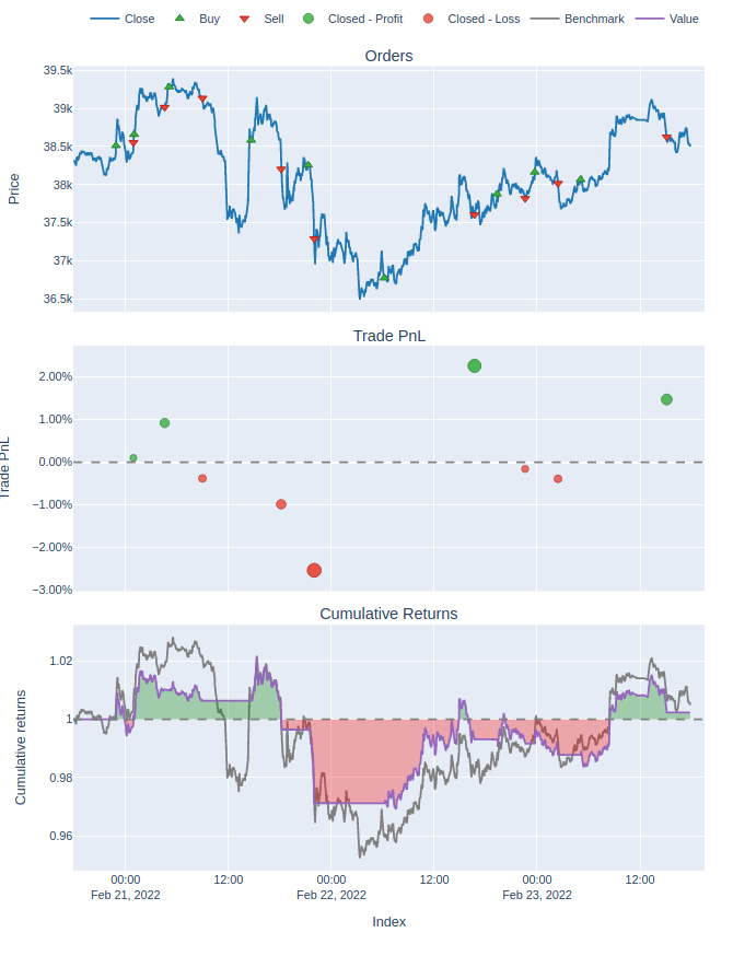
That's probably good enough for an initial look at a strategy. But we can dig deeper. There's also
1>>> pf.plot_positions().show()
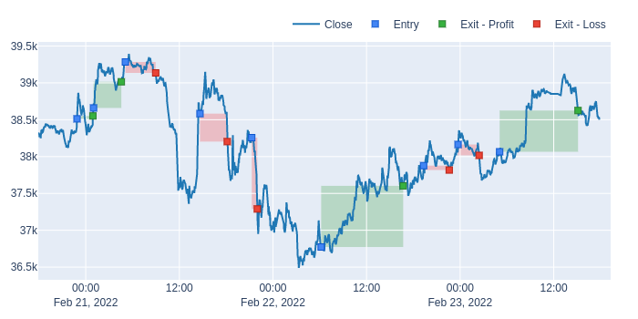
Which shows us all the trades that were taken and draws convenient rectangles showing the delta of the trade to give a quick overview of how well it's performing.
We also have
1>>> pf.plot_drawdowns().show()
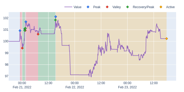
Which shows the draw-downs in various trades and helps us visualize our win rate and risk.
If you're willing to dig through the code, you can find more of these built-in plotting functions here.
Mixing and Matching Built-in Plots
If you'd like to plot more than one of the built-in plots to create a dashboard of sorts, you can edit the subplots parameter inside pf.plot.
1pf.plot(subplots = [
2... 'drawdowns',
3... 'trades']).show()
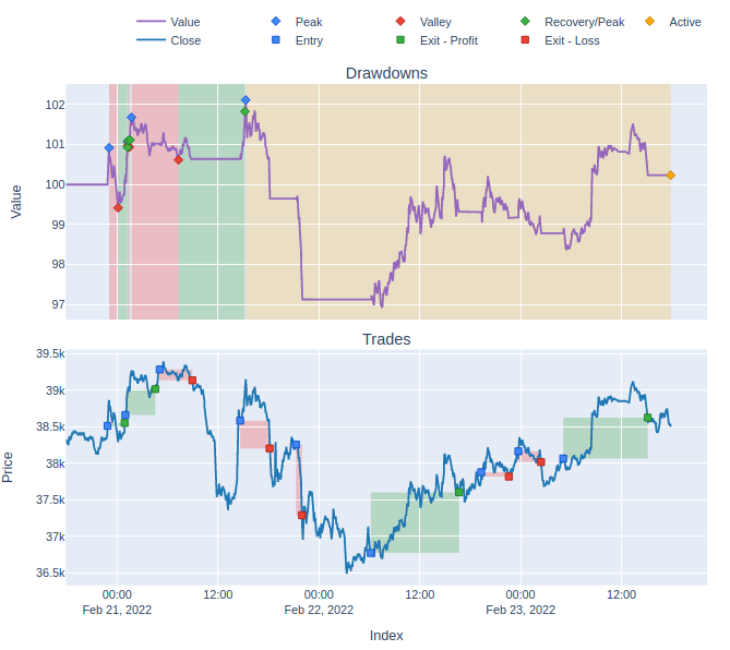
There's a full list of names for the built-in charts on the docs.
Creating Custom Charts
At this point we can start thinking about creating custom charts. To start with we'll keep things simple and just stick to one chart. The easiest way to get started with this is to pick a plotting function from the docs and have at it.
We've got all the normal chart types that you get in Plotly. scatter charts, bar graphs, box plots, etc. Anything that can be done in Plotly can be done in Vbt if you get the right syntax.
Let's plot our RSI values
 1fig = pf.plot(subplots = [
 2...     ('RSI', dict(
 3...         title = 'RSI',
 4...         yaxis_kwargs=dict(title='RSI'),
 5...         check_is_not_grouped=True,
 6...         ))
 7...     ],
 8...     make_subplots_kwargs = dict(rows=5,cols=1,shared_xaxes='all')
 9... )
10>>> scatter_rsi = vbt.plotting.Scatter(
11...         data = rsi.rsi,
12...         x_labels = rsi.rsi.index,
13...         trace_names = ["RSI"],
14...         add_trace_kwargs=dict(row=2, col=1),
15...         fig=fig
16...             )
17>>> fig.show()
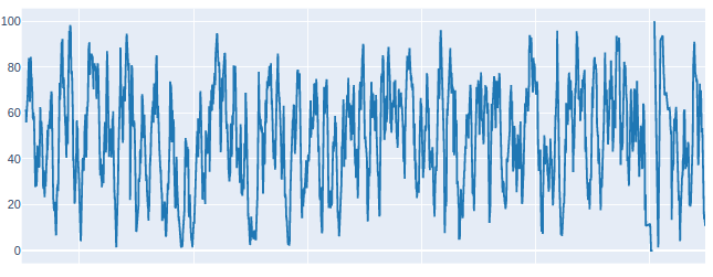
Note that we selected the second row to put our RSI in. That's because I'm going to insert another chart above it in a second. It might look a little wonky for now.
You'll notice that there are various options like yaxis_kwargs. This allows us to pass extra parameters that we'd normally specify in the equivalent plotly functions. You can experiment with this to change attributes like line color, thickness, etc.
In order to add another graph above our RSI, let us use the built-in graph orders.
 1fig = pf.plot(subplots = [
 2...     'orders',
 3...     ('RSI', dict(
 4...         title = 'RSI',
 5...         yaxis_kwargs=dict(title='RSI'),
 6...         check_is_not_grouped=True,
 7...         ))
 8...     ],
 9...     make_subplots_kwargs = dict(rows=5,cols=1,shared_xaxes='all')
10... )
11>>> scatter_rsi = vbt.plotting.Scatter(
12...         data = rsi.rsi,
13...         x_labels = rsi.rsi.index,
14...         trace_names = ["RSI"],
15...         add_trace_kwargs=dict(row=2, col=1),
16...         fig=fig
17...             )
18>>> fig.show()
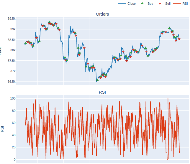
Note the order in which they appear in subplots, as it's the same order that they appear on the dashboard, and you'll have to set the row and column accordingly.
Much like any other Plotly figure, we can also add lines and other shapes to our graphs.
To give a simple example, let's add some horizontal lines for our RSI entry and exit points
 1>>> fig = fig.add_hline(  y=70,
 2...                 line_color="#858480",
 3...                 row = 2,
 4...                 col = 1,
 5...                 line_width = 5
 6... )
 7>>> fig = fig.add_hline(  y=30,
 8...                 line_color="#858480",
 9...                 row = 2,
10...                 col = 1,
11...                 line_width = 5
12... )
13>>> fig.show()
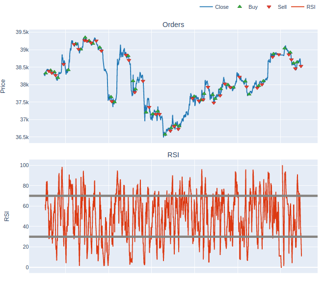
And there we have our final product! Not the prettiest thing in the world, but I leave it in your capable hands to edit the color-scheme as you require.
Video Tutorial
If you'd prefer a video tutorial, you can check out this free course on my youtube channel here: